
CASE STUDY · APP UI DESIGN · QUICKIE DELIVERY CO.
Redesigning the Quickie app for a smoother ordering experience
I led the redesign of the Quickie Delivery app’s user interface in Figma, for a student-founded delivery startup serving Cal Poly.

01 · The starting point
A menu, but not much more
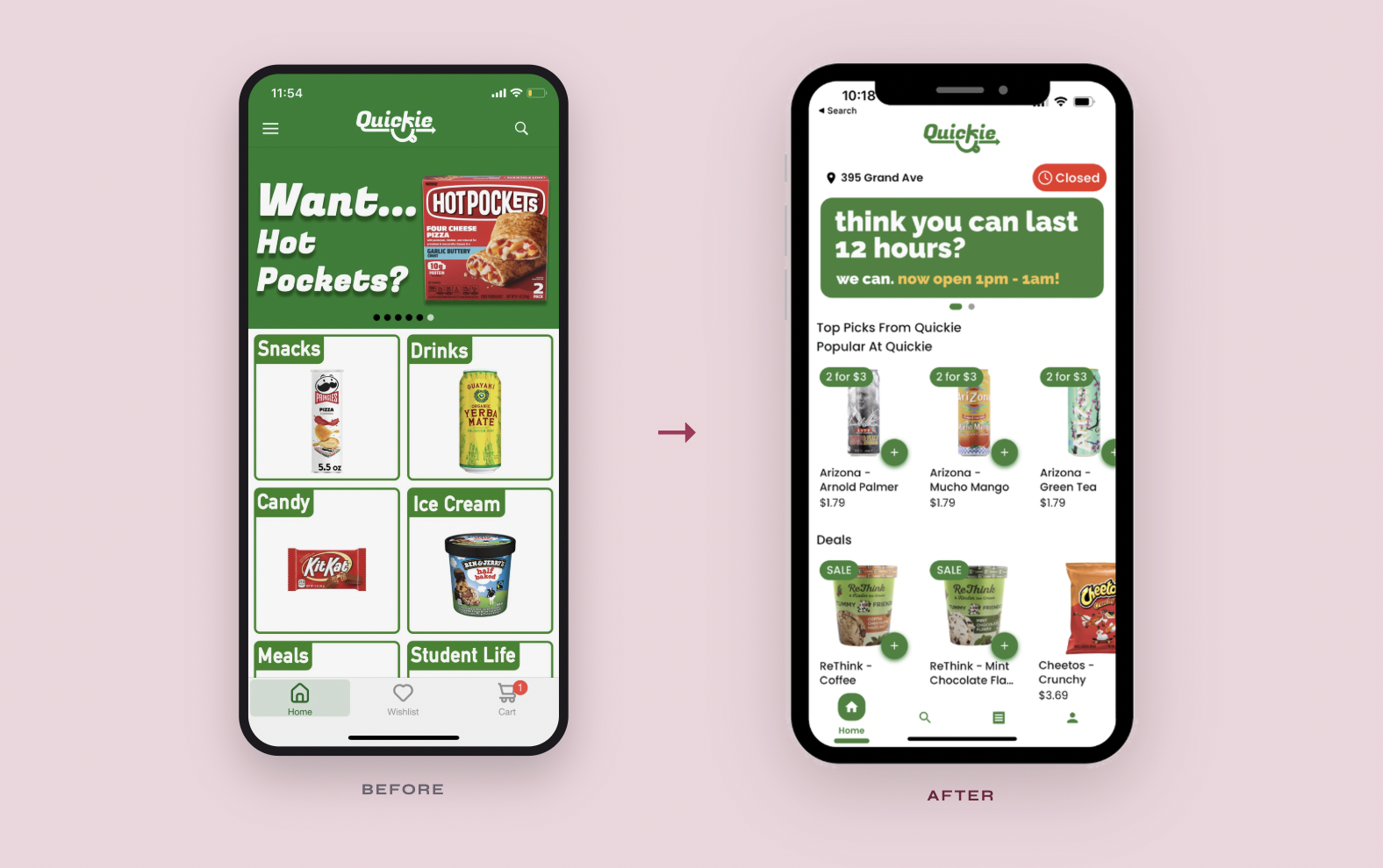
The original home screen opened on a rotating promo banner above six category tiles, Snacks, Drinks, Candy, Ice Cream, Meals and Student Life, with Home, Wishlist and Cart in the tab bar.
It worked as a catalog, but it didn’t tell students whether we were open, what was popular, what was on sale, or give them a reason to come back.


Four principles behind the redesign
02 · What I focused on

Key screens
03 · The redesign
Your address and store hours up top, a banner for current promos and campaigns, then Top Picks, Popular at Quickie, deals and categories to browse.
Home
Tap any item for a quick sheet with the photo, price and details, and add it to your cart without leaving the page.
Product pop-up
Delivery status, items, address and total in one place, with Contact Us to chat with your flasher or Quickie HQ.
Order details

A personal greeting, Quickie Cash, your rank, a referral code that rewards both friends, and a direct line for feedback.
Profile + rewards
04 · Outcome

What it changed

Takeaways